Hello my fellow Tuesdayers! I am working on a super-important to do list item today and it is literally changing my life. I never knew filling out a Bachelorette bracket would be so emotional 🙂
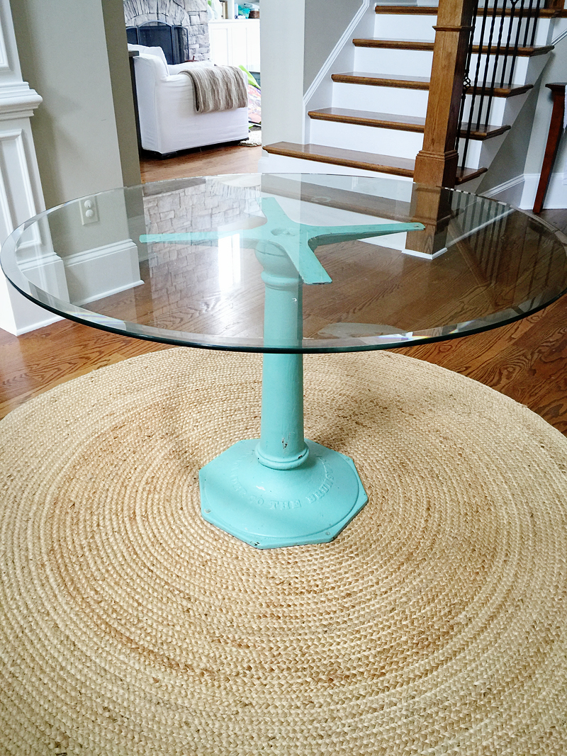
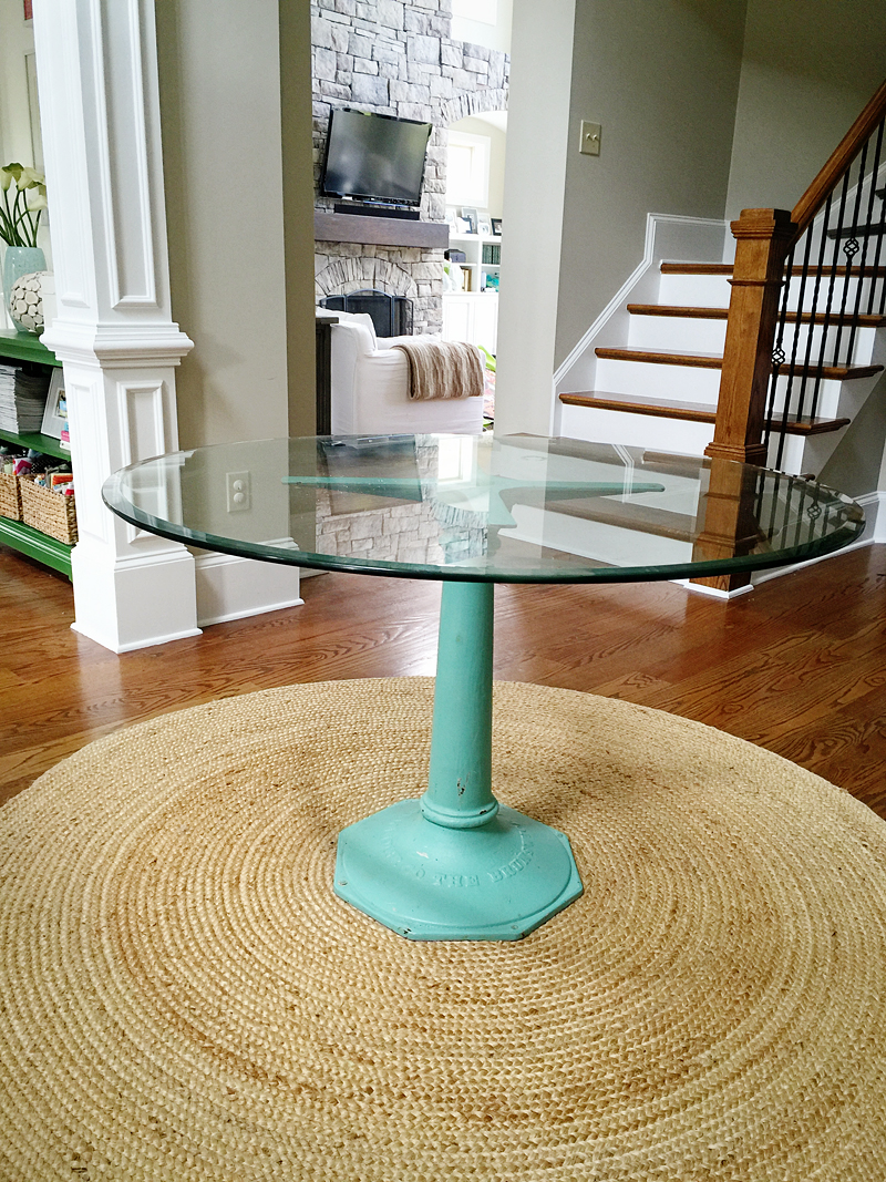
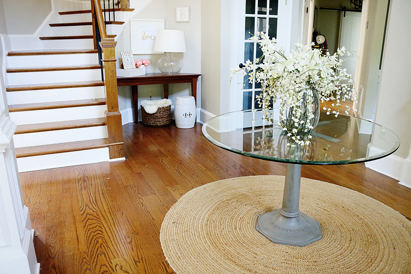
So while I work on that, I hope that you get a bit of fun info out of this post. It’s all about painting our foyer table which is a metal base with a glass top. Jeremy inherited it when his grandparents passed away and I LOVE it like it was gonna save my children from an apocalypse.
I had such a huge emotional attachment to it – more than even Jeremy I think – and I never even met his grandparents. Not only was the table so cool and individual but it was a personal gift to Jeremy and everyone knows how I feel about gifts. They are meant to be treasured and kept FOREVER. That mentality can cause some storage issues but I’m working on it 🙂
I hesitated painting it after Jeremy told me the story of his Mama B painting it that particular shade of turquoise. I personally adore the color and thought it was such a fun pop of saturation. It was like emotional turmoil – just the thought of repainting it was upsetting because she picked the color. It wasn’t until I saw some old videos of how stylish and refined she was that it just struck me….Mama B would want this table to look good in the space! And being turquoise wasn’t working.
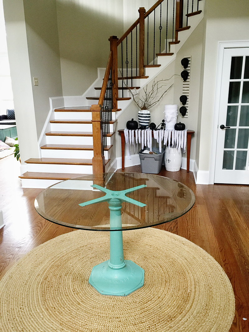
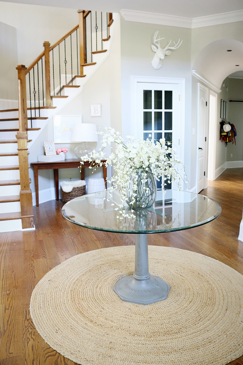
I found this old picture of when I was in the middle of decorating for Halloween and you can see that it sits right in the middle of our foyer and there is actually another table that is in the stair alcove area that is a different color. I hope that I can build a custom piece for that area that has a curved back so that I can make this setup less awkward but for now, it works.
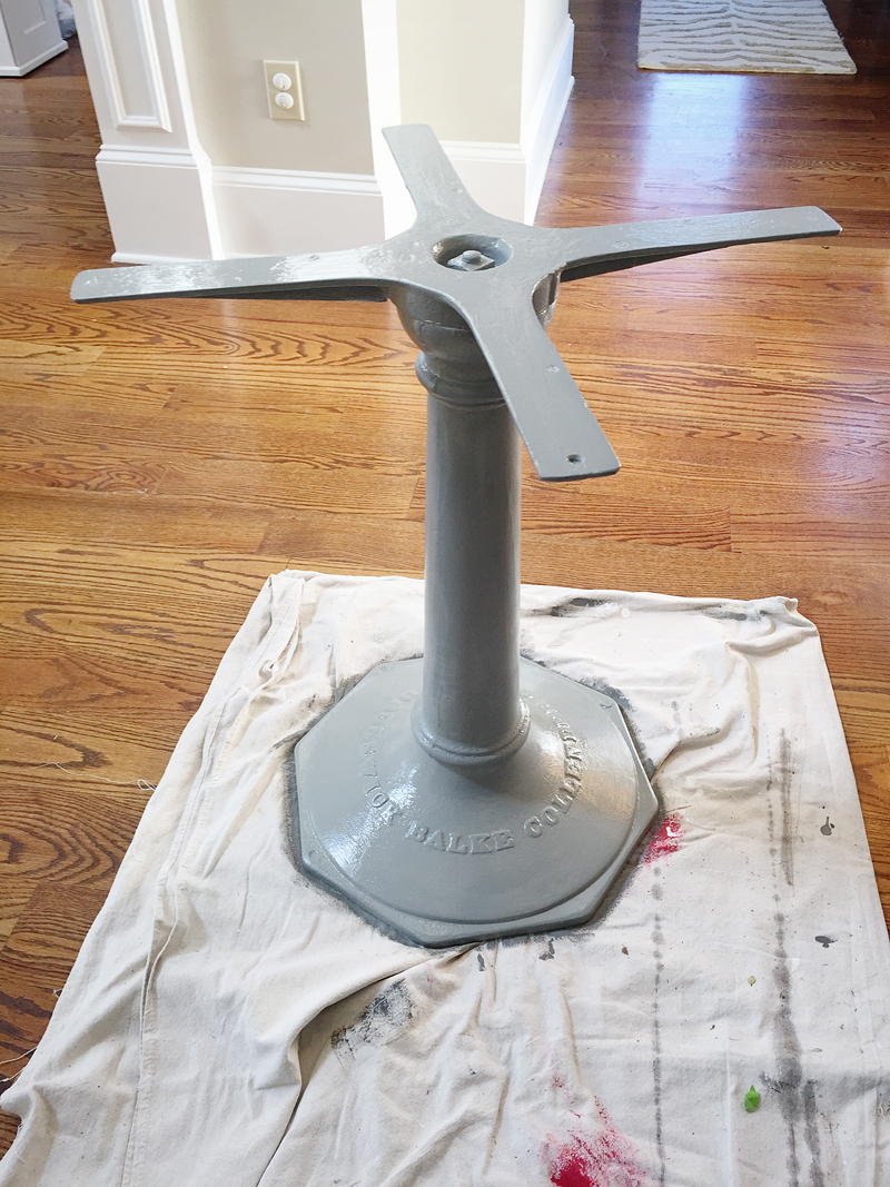
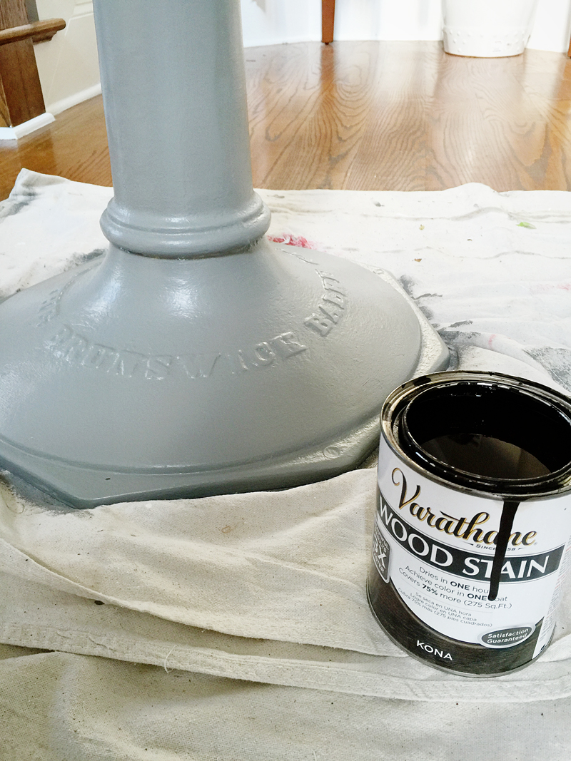
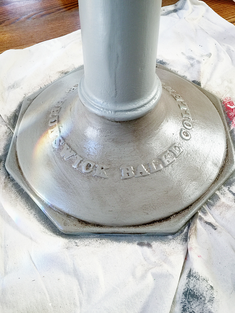
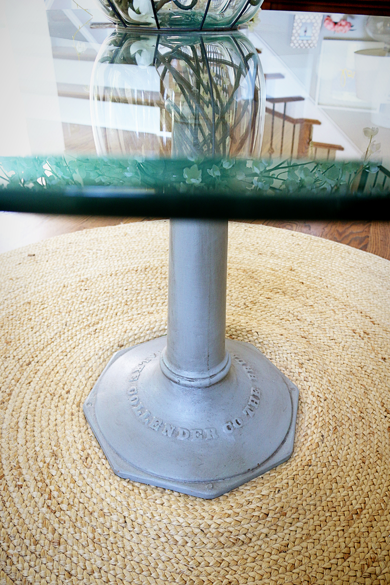
So the first thing I did was remove the glass top and tried not to kill myself or shatter it. Then I sanded down the flat surfaces of the base with a 220 grit sandpaper. I just needed a little grit for adhesion. Now, you can use a metal formulated paint but I didn’t. I just used a bit of leftover paint that is Sherwin Williams Amherst Gray – it is the same color I used on our sofa table.
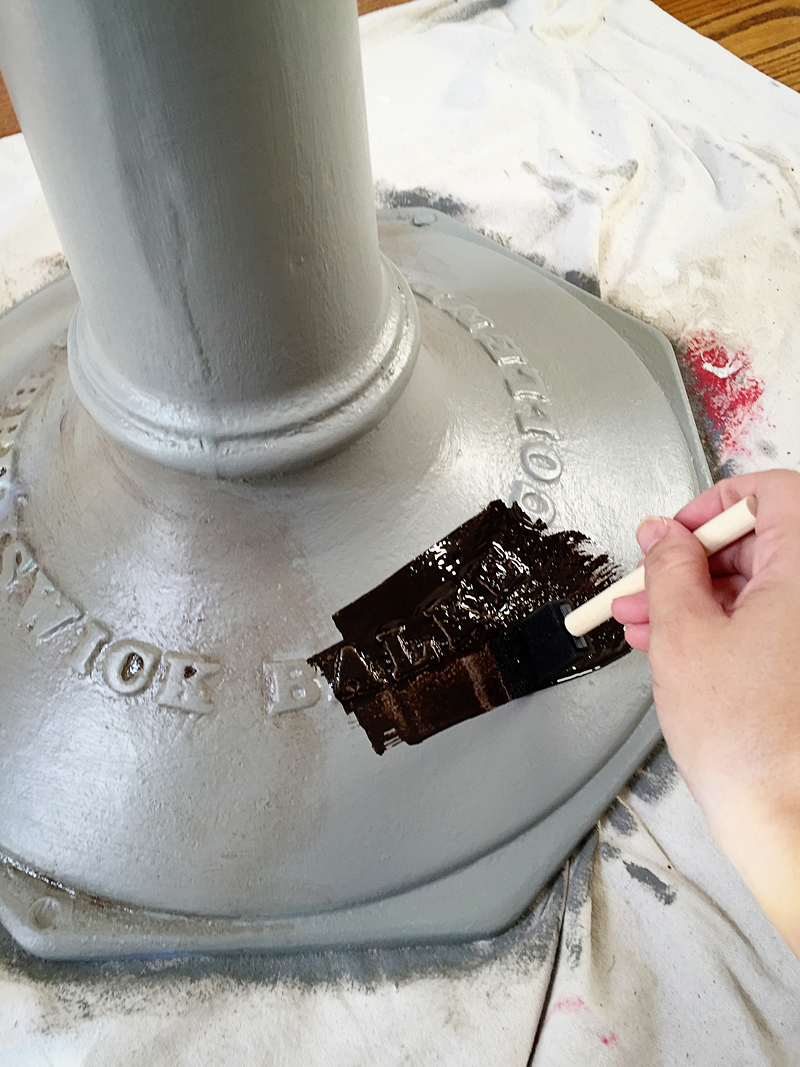
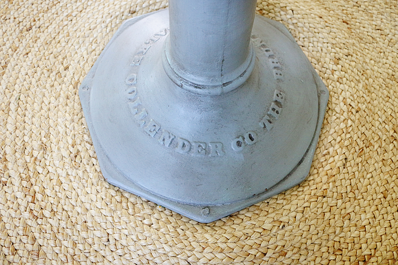
I wanted the piece to look a little old and used….kinda like it had been taken straight from a factory and made into a table. So to bring out the lettering and the details, I decided to use stain like a glaze and I crossed my fingers to see if it worked.
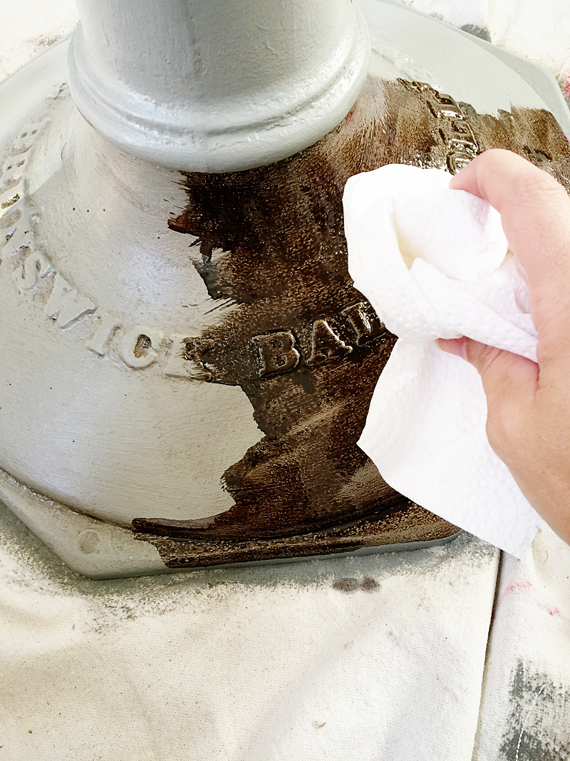
This could have failed miserably. You see, stain is made of two basic parts – a solvent and a colorant. When you apply it to furniture, the porous wood material can suck up some of that stain and you remove the excess. The amount it ‘sucks up’ is depending on the time you allowed it to draw in and then also the capacity of the material to hold the stain. So that’s why you don’t leave the stain on without removing the excess…it will sit suspended on the surface, become tacky and a big hot stain-y mess. So that is why this was risky….metal, unlike wood, does not have the capacity to draw in stain. It’s like an experiment….how much stain will adhere to a simple coat of paint?
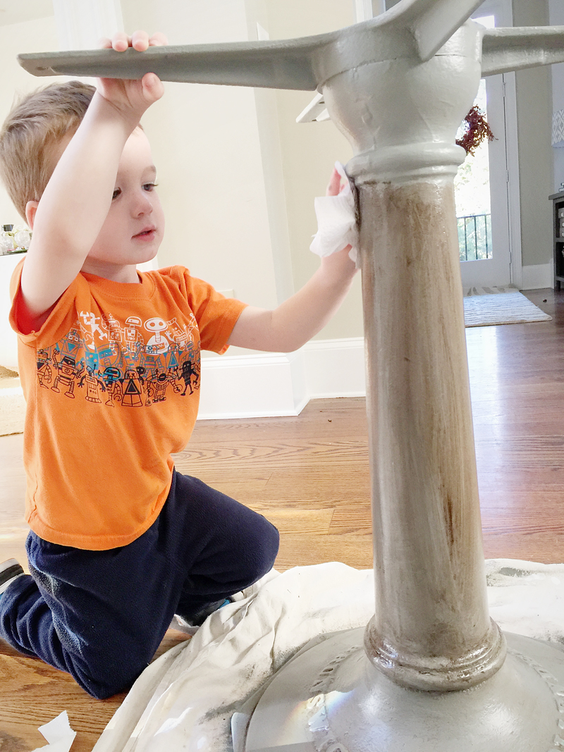
I applied it to the surface with a foam brush and rubbed any excess away with the paper towel.
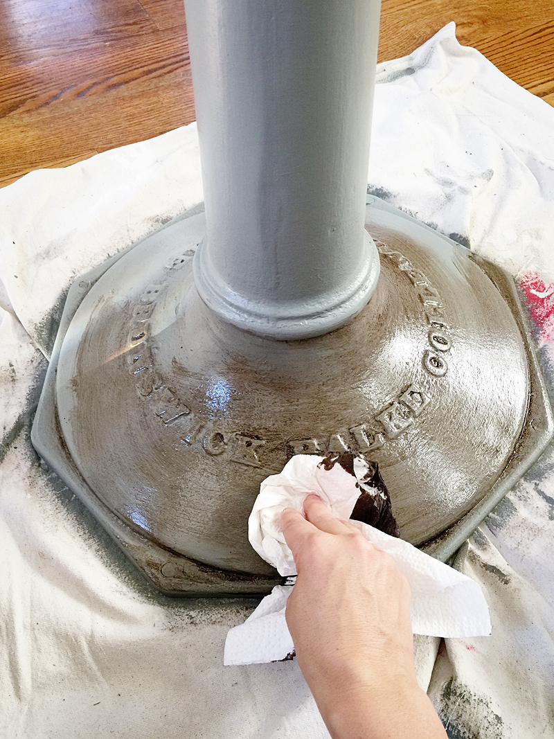
At first, I was sure it would be a big fat fail. I mean….I knew that was a possibility and recoating with paint and then using a traditional paint-based glaze wasn’t a bad idea.
But then it started drying a little longer and the paint actually did absorb some of that pigment!
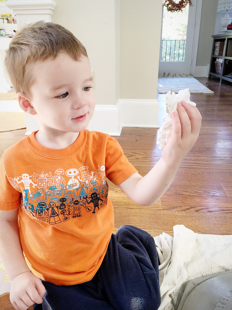
I can’t take all the credit for this beauty though….I had the world’s best assistant.
This kid is fire or ice baby. All or nothing. There is no gray in his world….except for this table that is 🙂
In the end, I am so glad we decided to paint the metal table and I am so glad that it actually worked!
The finish was just enough subtle contrast to make the letters draw attention and for the entire piece to look more industrial and more modern at the same time.
After painting it, I did a little research on the name – The Brunswick Balke Collender Co. and apparently this company was started in 1845 made a variety of things but focused on pool tables. This base would have been a pub table base. Cool huh!?
Now people use all sorts of things as table bases but I like to think Mama B was ahead of her time – making this pub table base into the table she used for a bright and cheery breakfast nook 🙂
And now it serves as a foyer table – greeting all our guests with toddler fingerprints and sometimes a yogurt shmear 🙂
Yes, I cleaned those off before taking this photo…but trust me – this afternoon, they will be back 🙂
So what do you think? Improvement? I’d love to hear if you have any pieces in your life that you inherited or received from family that has a good story or that you hesitated to tweak! I was so nervous but now looking back, I’m thinking WHY DIDN’T I DO THAT SOONER?! It just feels like such a better piece of our home….kinda like it should have always been there!
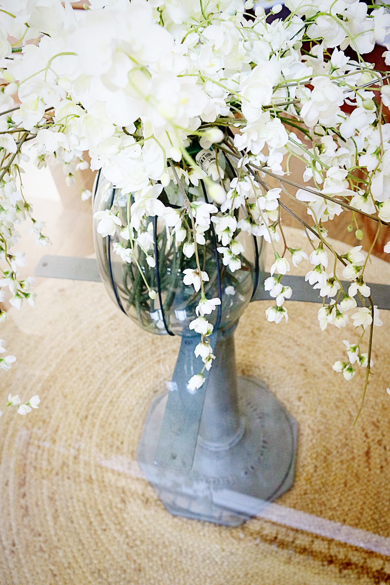
Oh man, I’m gonna need those faux flowers! That are STUNNING! How did you make it so perfect? Where did they come from?
They are from Pier1 🙂
xo – kb
I love the new look, definitely goes with your color scheme better. And like you said, Mama B would want it to took good in its new home. I also tweeked a hand me down piece – a hall tree given to us by my grandmother. I have it in my foyer and love seeing a mirror reflect light when you enter the house. What I didn’t like was the out dated hooks on it. So I switched them for something more modern. You can see what I did over at my blog: http://controllingcraziness.blogspot.com/2013/07/no-more-boob-hooks.html
i know you weren’t soliciting suggestions 🙂 – but i kind of love the idea of cozy club chair in the nook where your other table is!
Love the new color! Using the stain was very clever.
But, I have to ask… the glass top is not attached in anyway? That would just freak me out. Heck I only had 1 boy and he broke our glass top coffee table (no one was hurt, but I may have had a small heart attack). But now I am worried about your boys!
Hi. I’m all for diys that fit the taste and purpose of the diyer. I personally loved the before pop of color Any real !pop! would work. Grey does not pop. Sorry, this doesn’t work for me. I liked learning the technique tho and plan on using it on my own metal table base. Thank u Katie.
I was totally expecting you to do something that looked metallic like if it was ORB but the letters looked like they were rubbed by feet in their lifetime, revealing a slight brass shadow, totally surprised me here! Cool table.
It is super heavy…Weston hanged on it once and it didn’t budge! Of course, we don’t let him do that…but knowing that it is ridiculously heavy has helped us. I think it’s like anything glass in the house – teaching them how to behave around it is important for manners and safety!
xo – kb
Looks great! I love those pill top hooks you chose – they look like they were meant to be on it!
xo – kb
LOVE the pop of blue!!!! Great color!
While gray is not my color, it is your color and you did a fine job of making that heirloom table your own.
I think the table looks amazing! It certainly looks more industrial and authentic. Great job! Also, I noticed that you have the same animal head on the wall that I have! The only difference is mine has a multi-strand pearl necklace around his neck! =)
I think an antique white with your staining technique would look cool for your table too!
Wow. That’s wonderful transformation. Also , love the round rug. Where did you get them? (I am looking for something like that)
It was super cheap at RugsUsa.com!
xo – kb
I love all furniture that has a story attached to it. Your story is beautiful.
I kind of had an opposite dilemma. I once received an old mirror from my mother in law. I didn’t think to ask her if it was okay to paint the frame, and when she saw it she said, “I wouldn’t show that to Phil’s (my husband) grandma if I were you.” Oops. I mean, I figured that she GAVE it to me to enjoy, and I enjoyed it so much more after painting! She was not cool with that though…
Yikes! Was it previously clad in 24 carat gold? 🙂
xo – kb
I LOVE this! My husband’s grandparents both passed away right after we bought our house. Everything in my formal dining & living rooms came from their home. While most of it is nice stuff, it has never really been our style. Now that I stay home with the kids & am in the house more, it bothers me more. I’ve got plans for most of it. I’m relatively new at DIY & refinishing furniture so I’m kinda nervous. I want to start with Grandma Lee’s sewing table. It still has the original, working machine. I have my own so don’t need this but I imagine the value is pretty good which is why I’ve been so hesitant to change anything. I think I’m going to use white chalk paint & update the hardware. The dining room table isn’t hardwood so I’m limited in what I can do there. I think I’m going to lightly buff the top to get the glossy finish off & seal with a matte cherry finish. The legs, I’m going to chalk paint white. The upright piano isn’t hardwood either. I’m not sure what to do with that. I play but it’s really out of tune & that 1960’s orange wood color. If I can, I’d like to trade it in for a baby Grande. That is in the 5 year plan, when my daughter is old enough for lessons.
Do you have much experience with chalk paint? Any advice is appreciated.
I agree with Jill. In an all grey room that turquoise would have stood out great.
I would do a distressed wood top with some metal stripping around the edge, but then I don’t like glass tops.
The simplicity yet coherent look the table has after painting it, good gracious it looks amazing.
I’m not very keen on paints thus I checked Amherst Gray colour – “This color is part of the Historic Color collection. A collection of 191 time-honored hues. Unveiled in 1976 to celebrate the US bicentennial, a collection of 191 colors inspired by America’s historic landmarks.”
The paint had such an astonishing effect that it is hard for me to believe. How it emphasises the letters making them easy to spot with single glimpse.
I checked the sofa project you linked to. The paint goes ridiculously well on wood! From now on it’s my favourite grey hue!
True! I just don’t have an all gray foyer 🙁 It’s more of a latte color and the warm walls was a huge contrast to the table and the floors so it needed warm undertones. We all have different color views though – my mom always calls one of my paint colors green and I swear it is blue 🙂
xo – kb
I love chalk paint. The buttery velvet smooth finish is EVERYTHING. I would definitely recommend playing with it on some scrap wood first or something less valuable because the sanding part is what really makes it so nice. I’d love to see pictures when you are doing your projects!
xo – kb
Do you have a link to these flowers, I couldn’t find them? How many stems did you use? Thank you
Here you go! And I mixed in a couple of these.
xo – kb