Seriously HGTV.
Seriously.
Do you seriously think that men everywhere are going to tune into HGTV to catch the new design star make some weak jokes (and as the reigning queen of poor humor, I know a weak joke when I see one) with his manly bandana and his Tony Saprano attitude?

The correct answer is no. They will not. I checked with my boyfriend. And he concurred.
First of all – if a man is interested in home decor…then he will want to watch a show that has A DESIGNER WHO HAS GOOD DESIGNS.
I know.
It’s a shocker.
And frankly, Antonio is not funny enough to make me or the male population overlook the fact that his rooms are not visually pleasing. If a person wants to listen to funny jokes – they have a network for that…it’s called Comedy Central.
But before we go into a long debate over who makes the better television host – let’s first look at the basics. Let’s look at the designs of the final two contestants – here’s Antonio, the semi-funny tatted Italian:

and Dan, the budget blaming Dimpleton.

In their final challenge, they needed to redo an entire home (aka a kitchen, living room, and two bedrooms). 44 hours and $50,000 later, they went head-to-head to host and present the two families with their new homes. In order for you to follow my design logic, I decided to award a winner of each matchup with a Bower Power star…given by yours truly (in my phabulous designery name – KayBowWow).

So let’s look at those rooms, shall we??
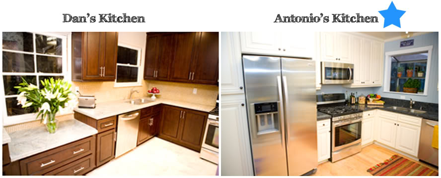
First up to bat is the kitchen battle. Dan’s kitchen was great with the dark cabinetry, the hidden washer & dryer area and the stainless steel appliances. Where he lost me was the combination of the creamy bamboo tile backsplash/tile floor and the grey marble countertops. The color of the backsplash went well with the floor choice but then the countertops seemed like the odd man out. Torie can’t be blamed for this one, Dan. ouch.
Antonio scored one here (yay Antonio – now go kiss a female cheerleader!) with his creamy white cabinetry and his dark countertops. But wait, what?! That was the homeowner’s suggestion. Oh yeah. But he still pulls the KayBowWow star with the beadboard backsplash that he thankfully changed from ‘my little pony’ purple to that refreshing slate blue color. Point – Antonio.
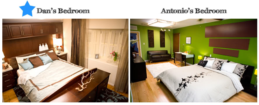
Moving onto the bedroom. Dan had some nice moves with his choice of storage-galore headboard and his gender neutral bedding (just in case the recent divorcee finds another man who likes lilac). And his homeowner still has the ability to sleep and remain sane from the color palatte that is oh-so-easy. Antonio’s color scheme however does not make me green with envy. In fact, I didn’t really like his design concept at all. Moving the bathroom door was a bold move and I give him props on that daring venture…but really Antonio – why move the ugly door only to put three measly frames on that wall. Do you really need a post on framing collages? Because I would be willing to show you gallery walls if you ask nicely 🙂 Point – Dan.
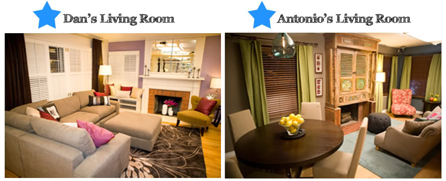
Ready for the Living room showdown? Well, this one is more of a draw in my book. And I do believe that I am being greatly generous to Antonio. Good job on getting those walls moved around – it really did help. But I can’t help but wonder if that fireplace ‘cabinet’ is allowing clearance for the heat that is sure to come from burning logs. And although I liked his choice of dining pendant light – I wonder about his use of space and color choice. In short…I would never choose Antonio’s room. It ain’t my style. Speaking of style – I actually prefer Dan’s living room. His use of mirrors over the fireplace is oh-so-Candice and I was clapping my leg when I saw that he took those curtain rods and hung them high and wide. Thanks to the drapery gods. My only qualm is that he left the fireplace surround untouched. Would applying some glass tile be that hard? The jury says no. It would not.
The final nail in Antonio’s design coffin is the kid’s room. Sweet Jesus forgive this man – he know’s not what he did. Just look at all that seating. Need I say more? Let’s move onto Dan before I start laughing. Dan’s bedroom is almost perfect for a 15 year old girl who is looking to be a little more sophisticated. My only real issue is that art. Have we heard of scale? Obviously not. Those little frames above the bed are kinda ridiculous and just look like wall clutter. What’s wrong with one big pendant over the bed with some larger frames that she can add photos of her latest crush? Nothing…that’s what. Especially since her crush will start with “E” and end with “dward Cullen”. So boy’s, the verdict is clear on this one – KayBowWow gives Dan the big blue star.
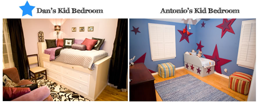
The tally is in – Dan 3, Antonio 2.
So where did Candice, Vern, and Genevieve go wrong?
Well, my friends – it is really simple. They believe something erronously. They think people actually watch their show to listen to them. Am I alone when I say – not a fat chance ? Here’s my confession – I DVR you guys and then fast forward anytime you go to talk. Don’t worry – I apologize everytime.
Listen up HGTV – we watch your shows for the GOOD IDEAS & GREAT DESIGN. And may I suggest that you start a new show for those ‘sparkling personalities’ – it can be HGTV’s Next Host Star. And leave Design Star to, well, the designers.
Rant over. Peace out.
Love, KayBowWow