It’s addicting. Looking at these Fixer Upper homes that the talented team of designers led by Joanna Gaines puts together and then seeing what they really look like through the lens of the homeowner. I love seeing what was put into the spaces after the staged scene was removed and how the house evolves in a real life home. And if you missed the full explanation of how this is even possible….READ THIS POST.
Okay. So I am back to share with you one of the most memorable houses the Chip & Jojo duo tackled. It was the midcentury modern ranch and I can’t wait to discuss all these differences with you! Let’s just get right to it!
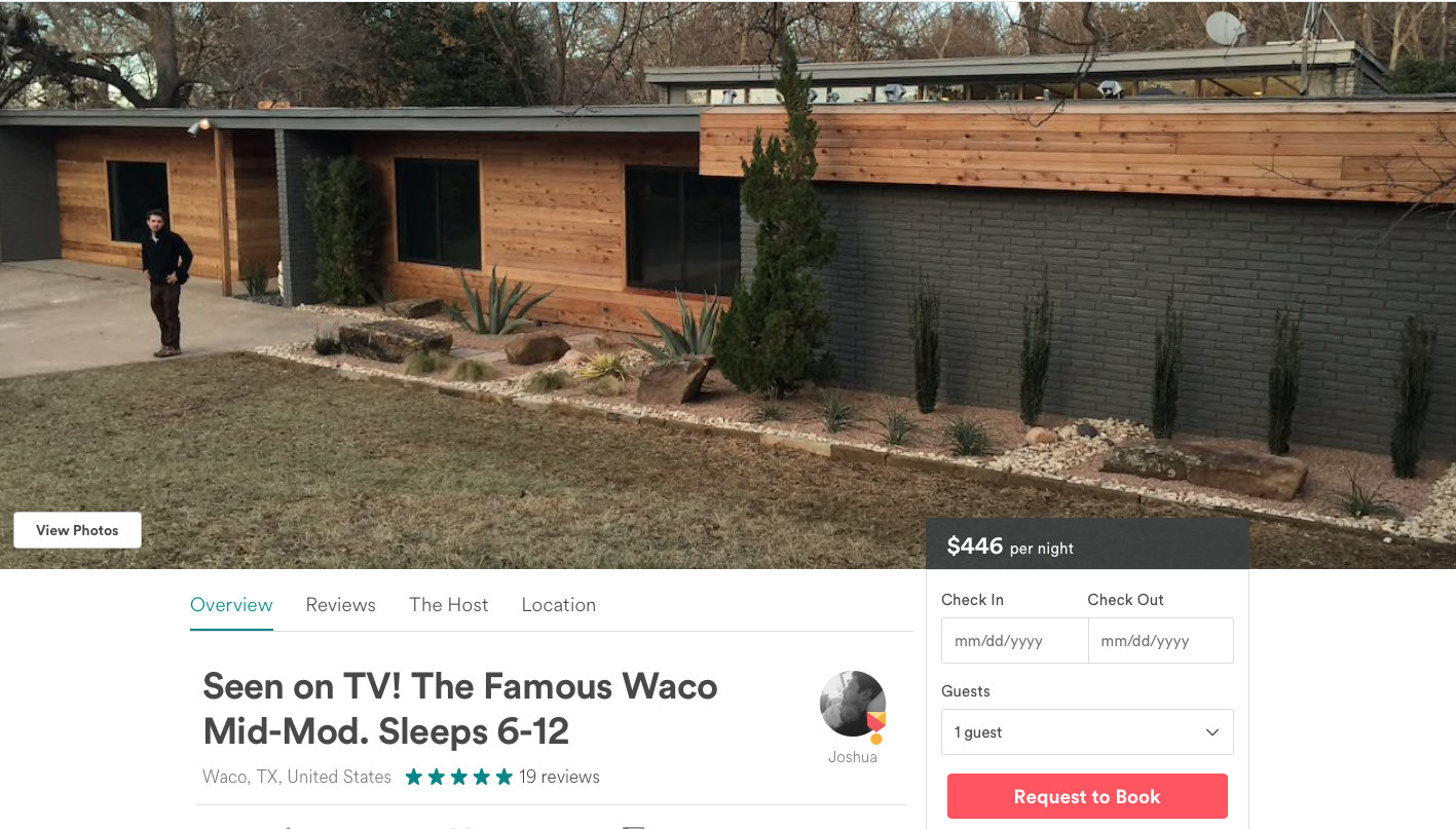
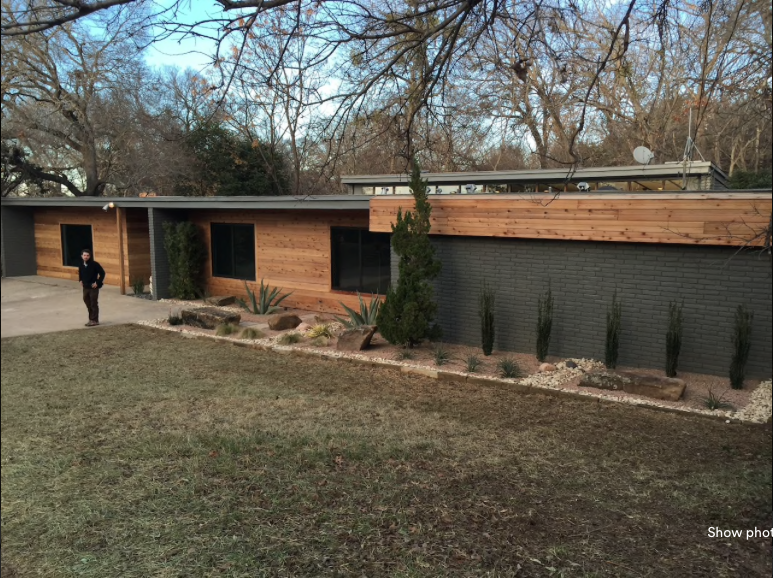
Here is the ranch in all it’s dark gray and wood accented glory! And for sleeping 12 people – $446 a night sounds super reasonable. That breaks down into $37 a pop guys. Time for a road trip 🙂
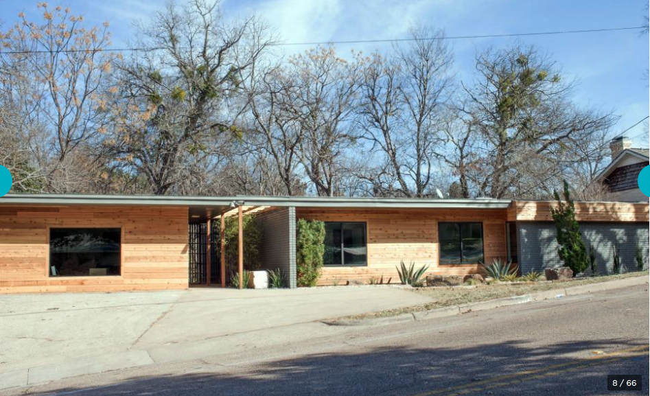
So after the show aired, we got a first glimpse into the after of the ranch home. It came a long way from the odd looking before and the HGTV pictures do not do it justice like the homeowners. The show photo is above and this is the homeowners pic. Isn’t this so much cuter to you?! I’m all about that little bump out on the roof with windows!
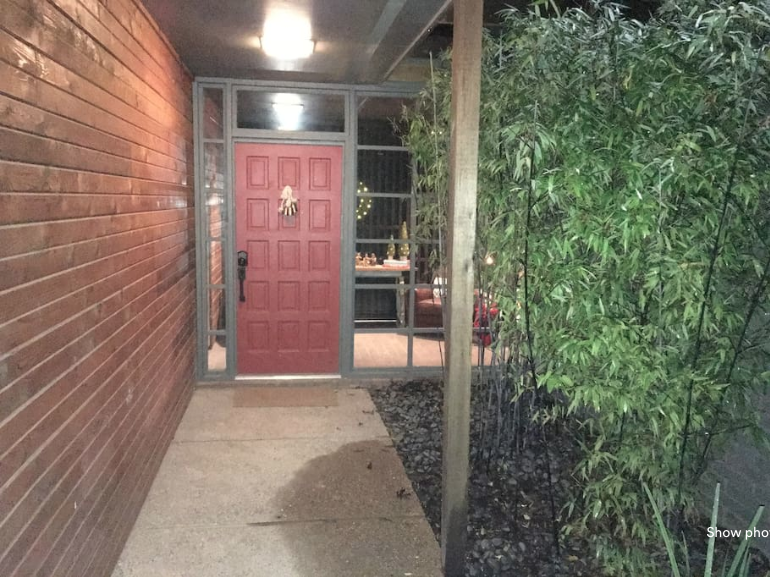
In the show pics, they share the painted door….its vibrant red and has amazing hardware.
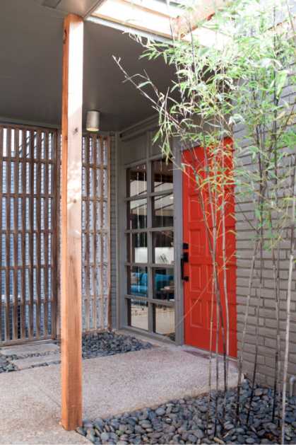
And then in the homeowners pics, you see this door…which yes, is a completely different door in a different location. But it’s weird right? I mean, they would have used the same red for exterior doors, right? And the hardware is completely different. Which leads me to believe that maybe they painted it the same but the picture is faded out…and that maybe the hardware isn’t consistent on exterior doors. Little details I never thought of before.
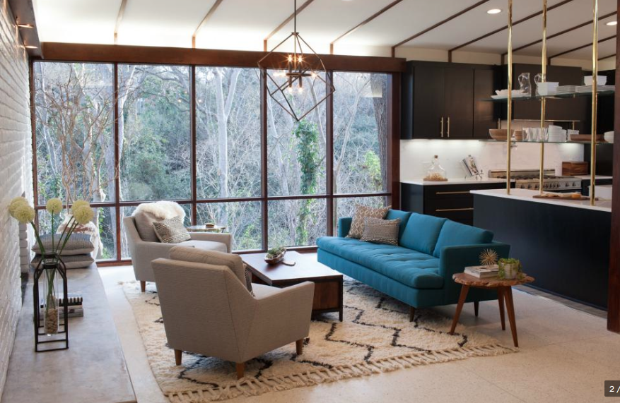
The staged version of the living room felt vibrant and clean and modern and made you look out those beautiful windows.
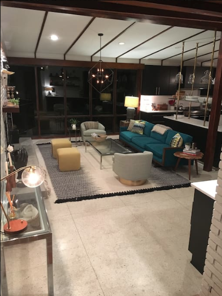
Obviously it’s hard to compare this shot because it’s at night….but I can appreciate that the homeowners took some serious cues from the designer team. They used a similar couch with the same bright color and contrasted it with lighter chairs in a different layout. I also really like the homeowners rug so points to them! I do think that the staging team did scale better but I can appreciate the effort to mimic the layout. Also…I think that the fireplace needs to lose the mantel…especially since this vibe is so modern. I get it. The desire for a mantel is real. I should know….our house didn’t have one and we put it in. But in this case, I liked the Joanna version better.
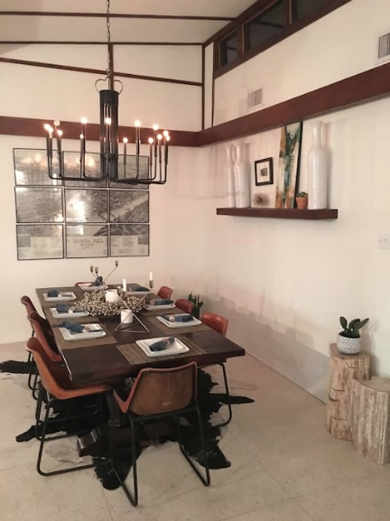
Moving to the dining room, we have this AMAZING well lit space with a big chandy and a clean vibe.
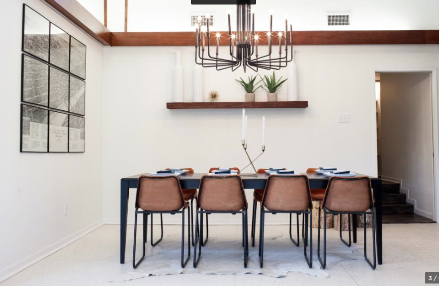
It looks like the homeowners kept the shelf and the art/map and the chairs but switched out the table and the rug. I personally like the darker hide rug. Does this homeowner just know rugs or what?! And I appreciate that they didn’t bog down the space with a buffet. Also…you can see that these folks are 3 to a side kinda dining people 🙂
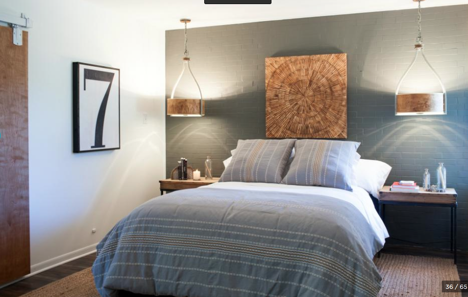
One of the most interesting spaces that Joanna’s team whipped up was this bedroom. Isn’t that fun with the hanging fixtures and the brick accent wall. I think that this was an interesting space that mixed casual with midcentury and I loved it.
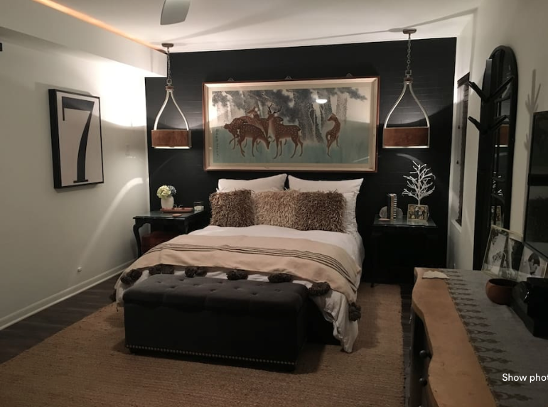
In the after I was shocked to see some of the changes. For one, that gray wall is now black. And the bedside tables were replaced with other non-modern, non-mid versions. BUT on the plus side, I think that it actually still looks good! The artwork is whimsical and modern enough and the colors work with the light fixtures. The bed has a new bench at the end that makes sense in such a long space. The rug looks similar and overall, it looks different but still put together.
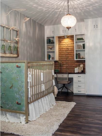
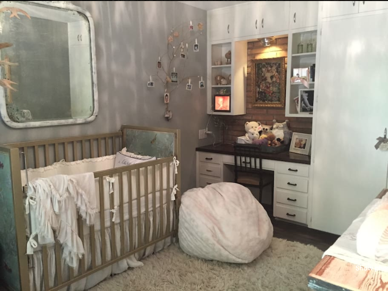
One space that I never really went gooey eyes over was this nursery. Maybe it’s because I am weird about nurseries but who knows. For whatever reason, the light fixture and bed don’t jive with the brick and the rustic window in my brain. But again…I am not a trained designer so what do I know. So that being said – this is the before….
And afterward, the nursery looks like this. I will be the first to admit that nurseries are hard to pair down in. You just have so much baby stuff. So even though they kept the crib and the bird mobile….I can understand why there seems to be so much more stuff in the room. I will say this….so glad they went with a bigger rug. I mean…I think every kids room should have a big rug or carpeting just because it’s soft. Mama loves soft.
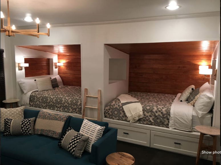
And in a surprise turn of events….THERE IS A EXTRA SLEEPING SPACE! Just look at this! I mean….this is in the AirBnB listing and it’s a big tv space with these built in twin beds! It’s beautiful right?! Did I miss this completely on that episode or something? Because this space is not listed on the HGTV site and it’s one of my favorites 🙂
So again….great design by Joanna and the Fixer Upper folks and I love seeing the tweaks by the homeowners. Its so fun to see the real life version of these homes. What was your favorite tweak? Mine was the rug in the nursery. My old knees are thanking the homeowners for that one. What were you glad they kept? I was so glad they bought the dining chairs – they are all sorts of right. Seriously…the leather and metal frames with that light…it’s just a match made in heaven!
All the Fixer Upper/HGTV pics are credited to Rachel Whyte here. And the listing for the Mid Mod Ranch rental is here.