Disclaimer – This post is sponsored by The National Association of Realtors. All opinions are 100% my own. For additional home finance tips, check out HouseLogic.com
Have you ever received an invitation to a Painting Party? Yes? No? Well, if you have never attended this event of a lifetime, let me explain. Friends buy their dream house. They are ready to move in. But first, they send out a Painting Party invitation to their closest and handiest friends to give each room a fresh new makeover in their new abode. They supply the pizza. You arm yourself with rollers and brushes. It’s fun and productive and overall a super fresh feel for every new dream home.
The problem is….most folks don’t plan ahead and they end up needing to repaint later. In the long run, it wastes money and time and energy. You can pretend you are seeing a crying emoji face right about now.
You see, homeowners may have had the best intentions and the problem isn’t the act of painting ahead of moving in….the problem is the lack of planning when it comes to creating the new home’s color scheme. Every new homeowner should plan out their dream home’s color scheme way before breaking out the rollers. In fact, you can actually start the planning process when you first tour a home with your realtor. Ask them questions about the house to hear details that can help you pick the right color scheme and make your next house more like heaven. Details such as house history and house layout can be vital information when it comes to the color scheme too. Here are some important questions to ask when you first start planning…
- Is this home historical? You may want to consider using a historically correct color for the year it was built. A paint specialist at your home improvement store can help identify those options.
- Does it have any original features? Those original features may be highlighted with an original color.
- Is there any architectural detail that makes this place special? Architectural details can pop with color or fade into the background with white or black.
- What rooms get the most light? Light can change the way the color is perceived so it’s important to know.
- Is this open concept with views of different rooms? If wall colors are seen next to each other, will they look good together? Keep these facts in mind when choosing your palette.
- What size are these spaces? Larger spaces and higher ceilings can intensify certain colors.
Once you have an idea of what you are dealing with, here is one method to put together a color scheme that will work for your family so that you can get your painting party underway. In a nutshell, this method is a five step plan – get inspired, establish your vibe, pick out your textiles, pick your accent colors and then finally pick out your wall paint.
source – Bower Power
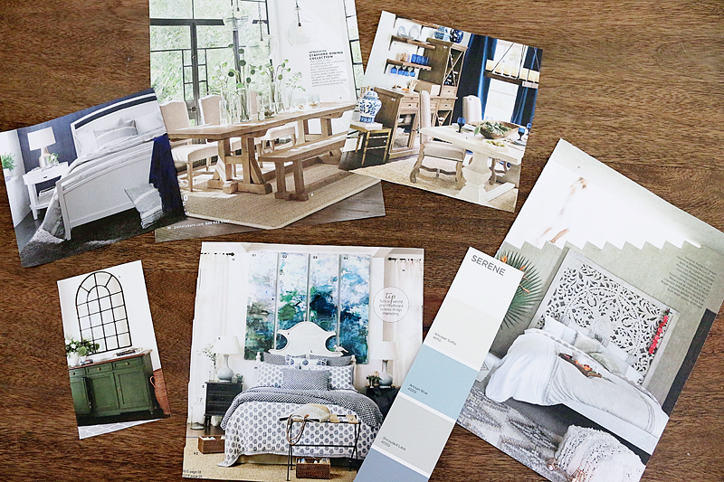
FIND INSPIRATION FOR YOUR ROOMS
Discover the colors that you are naturally attracted to by simply flipping through magazines and catalogs and tearing out your favorite photos of rooms. You can do this virtually online with sites like Google and Pinterest. The key is to gather all of your inspirational photos together and find common threads in colors. It may be that all the photos have gray walls or blue accents. You may discover other things about your style too like your furniture preferences or your light fixture style. Focus on the colors alone and write down the list of hues that you find attractive. This will be a good ‘true north’ for you if you become overwhelmed with all the options. If all the inspirational rooms are neutral with punches of color, then remember, you like neutral. If the rooms are white walls with high contrast, you like white. If the rooms are dark walls with moody accessories, you like dark.
source – Bower Power
DECIDE YOUR VIBE
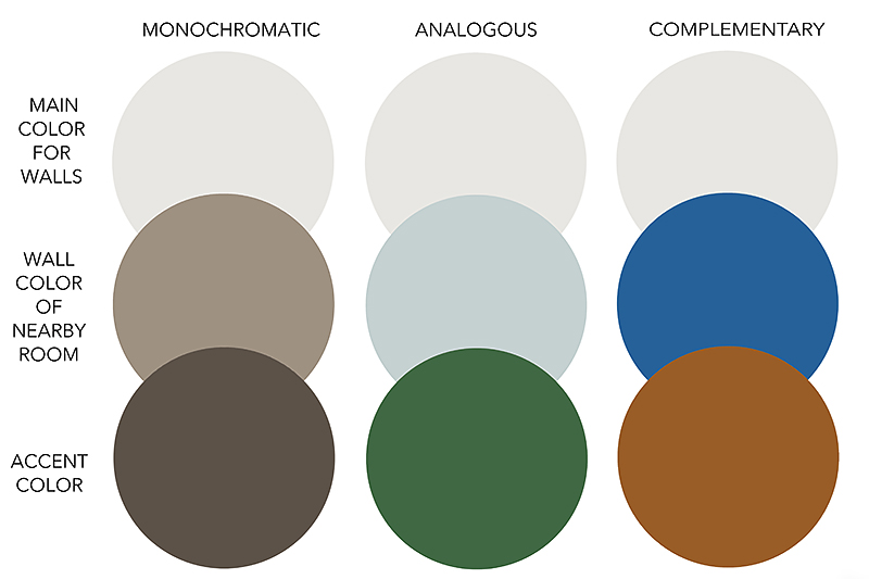
Now that you have your true north established, get a deck of paint swatches so that you can determine if you like monochromatic rooms, a more punchy room or something complementary. You can do this by choosing one neutral color that you like and see what you are most attracted to when it comes to partnering colors with that neutral. There is no wrong answer.
For this example, I picked greige (that first color row above) as my neutral color to see what would work with it. Analogous colors are pleasing to the eye because they’re next to each other in the color wheel and often found in nature. Complementary colors are high contrast and create a vibrant look beause they’re opposite each other on color wheel. Research more about color theory to understand this idea better. Whatever those colors are….know that you are deciding your vibe by picking three main colors you love.

source – Bower Power
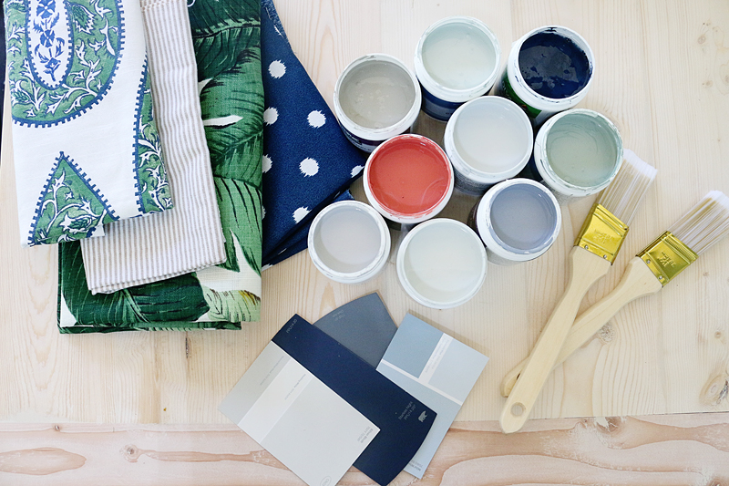
PICK OUT TEXTILES
Now that you have your inspiration and your vibe established, it is time to go shopping! This could mean that you are simply ‘shopping your stash’ or it could be that your finding new wares for your new abode. Whatever it means…figure out what upholstery, curtains and rugs are going to live in the rooms and get fabric swatches of those items. This way you can group all the fabrics for one room together and see the colors in one visual spot. This will help you determine the color to pick for walls. It also is a great time to purge items that don’t fit into your new style or go with that room’s color scheme.
Whip out your paint deck again and see what works with your textiles based on your established vibe and your inspiration. You may have dark curtains and dark furniture and want to lighten up the space. Pick out a lighter color for the walls. If you want to make it feel more like a caccoon, pick out something dark. But remember, it should go with your overall desired vibe. For example, if you want to have an industrial vibe, steer clear of bright sunny yellow. You don’t need to know the EXACT color right now…just that the living room is gonna be light blue and the dining room is going gray. Also, keep in mind adjoining rooms. When you stand in a room and see the color on the walls in other neighboring rooms, this is called a sightline and the colors that are in those rooms need to look good next to one another.

source – Bower Power
DETERMINE ACCENT COLORS
Now that you have your textiles and a basic idea of what room is going to be what color, it is time to choose accent colors. True accent colors can come directly from fabrics or throw pillows or artwork or even your favorite stationary. I like to pick at least two accent colors for each space. That accent color is used sparingly throughout the space but enough to make it feel intentional. It should go well with the textiles in that space. An accent color can be the hue you use on an accent wall. Consider using a wall color in one space as an accent color in a neighboring room.
source – Bower Power
TEST IT OUT
Now that you have determined your idea of a wall color and the specifics of your accent colors that coordinate with your textiles and align well with your style, it’s time to test some colors for your WALL paint. You already know the generic idea…but now to figure out specifically the shade that you will LOVE. Remember that paint colors look different in natural light and artificial lighting, often dry darker, and can coordinate or clash with undertones in flooring, stone and tile and even cabinetry. It is very helpful to search images of the specific colors online to see if you like the look in other’s spaces. I like to pick 3-5 paint colors for the walls before getting samplers of that color. Then just make sure you test all your options before choosing the specific hue and color plan for that room. After you choose the wall color, double check that it coordinates with all the existing features, furniture and textiles and then write down your picks for the walls and any painted accent areas or furniture.
You did it! All your colors should play nicely with the neighboring rooms because your hard work! Now you can confidently say that you have a plan for all the spaces and it will definitely work well with the other pieces in your space. Time to text your friends, break out the rollers and order the pizza! Happy painting!