Let’s get on this puppy!
So this week is gonna be SICK. I mean…like we are gonna fly through so much of the Pedraza kitchen that your head might spin. But I feel like if I let it drag then it gets annoying. All that to say – let’s get ready for a huge number of Pedraza kitchen posts this week to catch you up and fill you in. If you are confused and are like Pedra-what?! Then read this old post about who this family is and what we are doing to help them out and why. It’s a great way we get to share the love and provide some muscle but I do want you all to know that we can’t take all the credit. So many brands stepped forward to help in this project, providing cabinets to appliances….which is just heartwarming and we are super grateful. And Danny & Charity have been real champs…helping watch the kids while we tackle the DIY stuff, doing tedious tasks after work when we are at home doing other projects and overall being Olympians about the fact that we take WAY too many pictures and we basically left them kitchen-less. Thanks friends. We know washing dishes in your only bathroom is not fun….but it will be worth it. I promise 🙂
OKAY. Movin’ along.
This kitchen before was crabby and cramped and crappy. Overall it was a designer’s nightmare. Like close your eyes and shutter because that is what everyone did in this room. It didn’t function well. It didn’t look good. It didn’t fit more than one person.
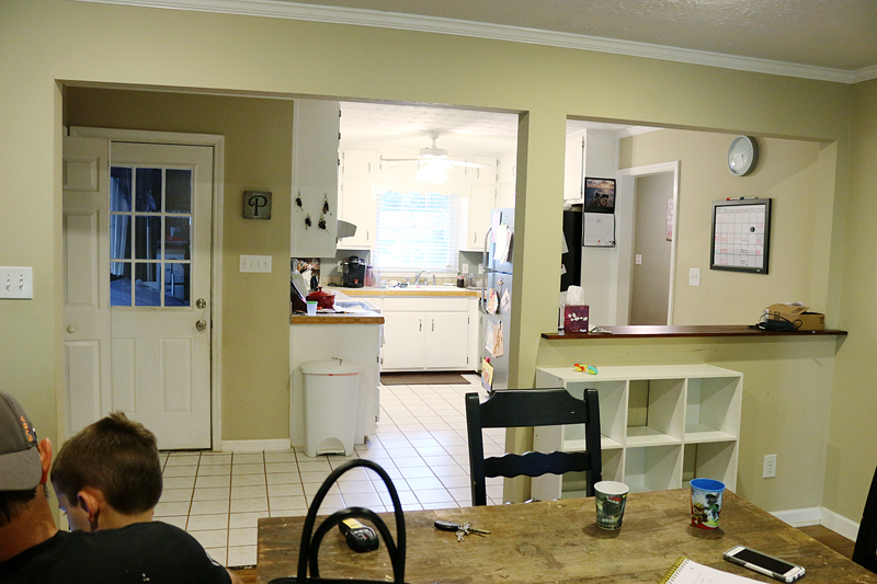
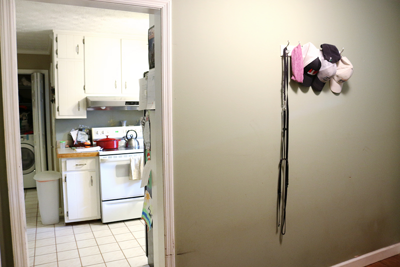
The view from the dining area. To the left of the kitchen was the laundry nook….to the right was the foyer hall.
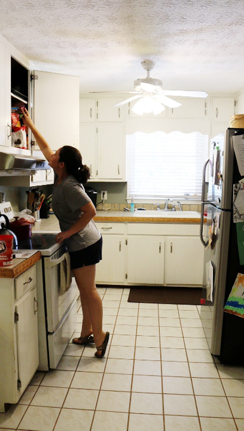
The kitchen itself was smooched all into this 9’x9′ space.
In my opinion the biggest problem was flow. They just simply didn’t have enough counter space and the appliances were all on top of one another. Plus, add a low-hanging ceiling light into the mix and you have one very cramped space….from all sides.
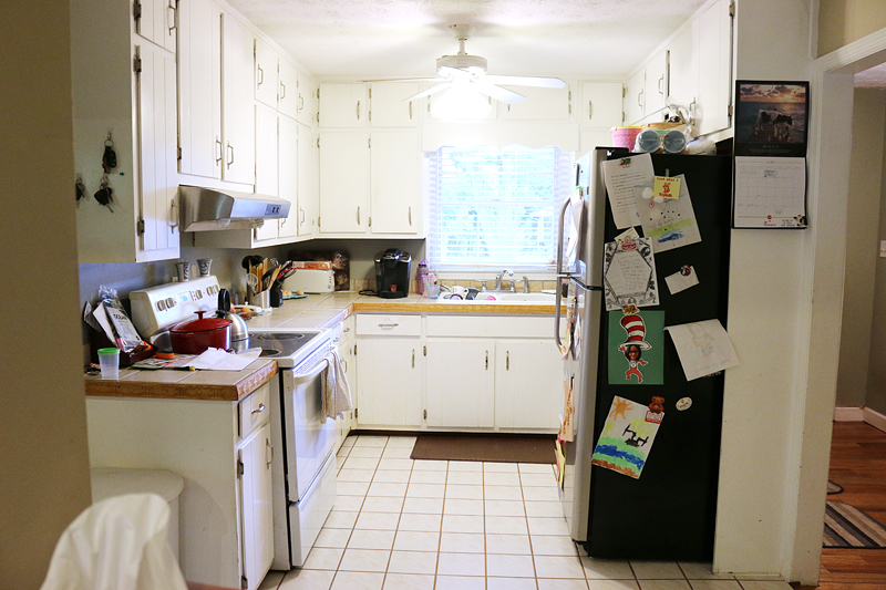
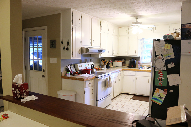
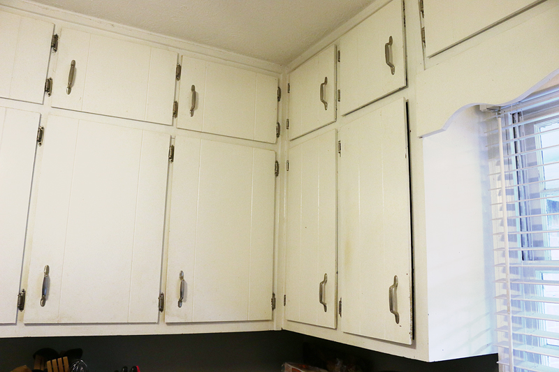
The cabinets were those ‘handyman specials’ that had been painted white to help them feel cleaner but in general, it really didn’t help. They still were not level, ill fitting and too small to hold even 12″ dinner plates.
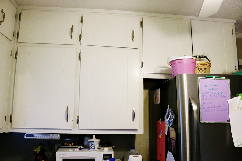
The doors did not close and Charity had to dedicate half of them to food because she had no dedicated pantry area.
The weirdest thing about the kitchen was the dishwasher location….it opened right in front of the sink. So when Charity went to load it, she literally had to stand on the other side of the dishwasher door and stretch to reach any dirty dishes in the sink.
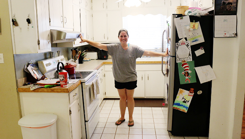
See how tight this space is? And Charity is a very small person. I am a full head taller than her at 5’7″ and she could still stand in the center of the kitchen and reach ALL the appliances and the sink. Danny, well, he had to avoid hitting his head on the ceiling fan 🙂
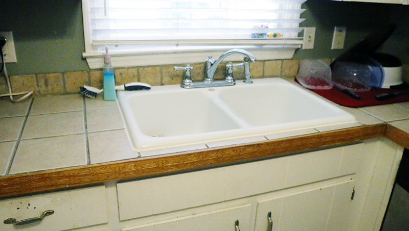
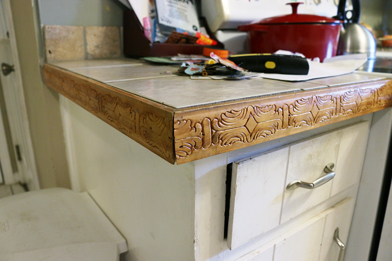
Charity’s biggest complaint wasn’t even the flow or the appliances that were falling apart….it was the countertop and I completely understand her point. Apparently floor tiles with a mismatched ‘backsplash’ (if you can call the single line of tumbled tile behind it on the wall a backsplash) and dirty looking grout lines capped with some decorative wood is REALLY hard to keep clean. A solid surface countertop was needed. badly.
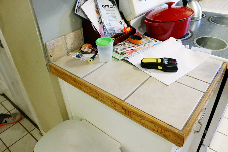
Just another look at that decorative wood for you guys to fawn over…
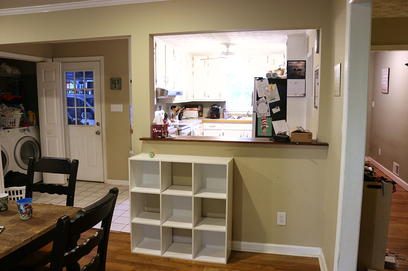
And then between the dining room and the kitchen was a weird pass through window thing….not big enough to be a bar….not really big enough to be anything. BUT that wall with the clock….that was structural….the one with the pass through….also load bearing….and so we had to think strategically about where things were going to be moved or modified.
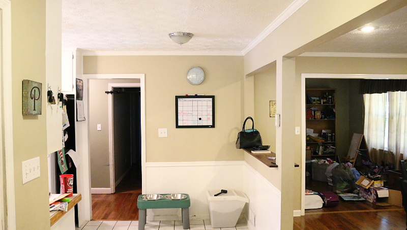
This is the view of the kitchen from the foyer hall….and this is where I got the idea to borrow some visual space. This area before was just a dark waste. It didn’t get used and it really was making the kitchen feel more cramped. Our plan was to make this doorway much bigger and allow that open concept feeling to allow for more space.
Okay – so here is the before….foyer having lots of extra elbow room, kitchen needing more walls…. 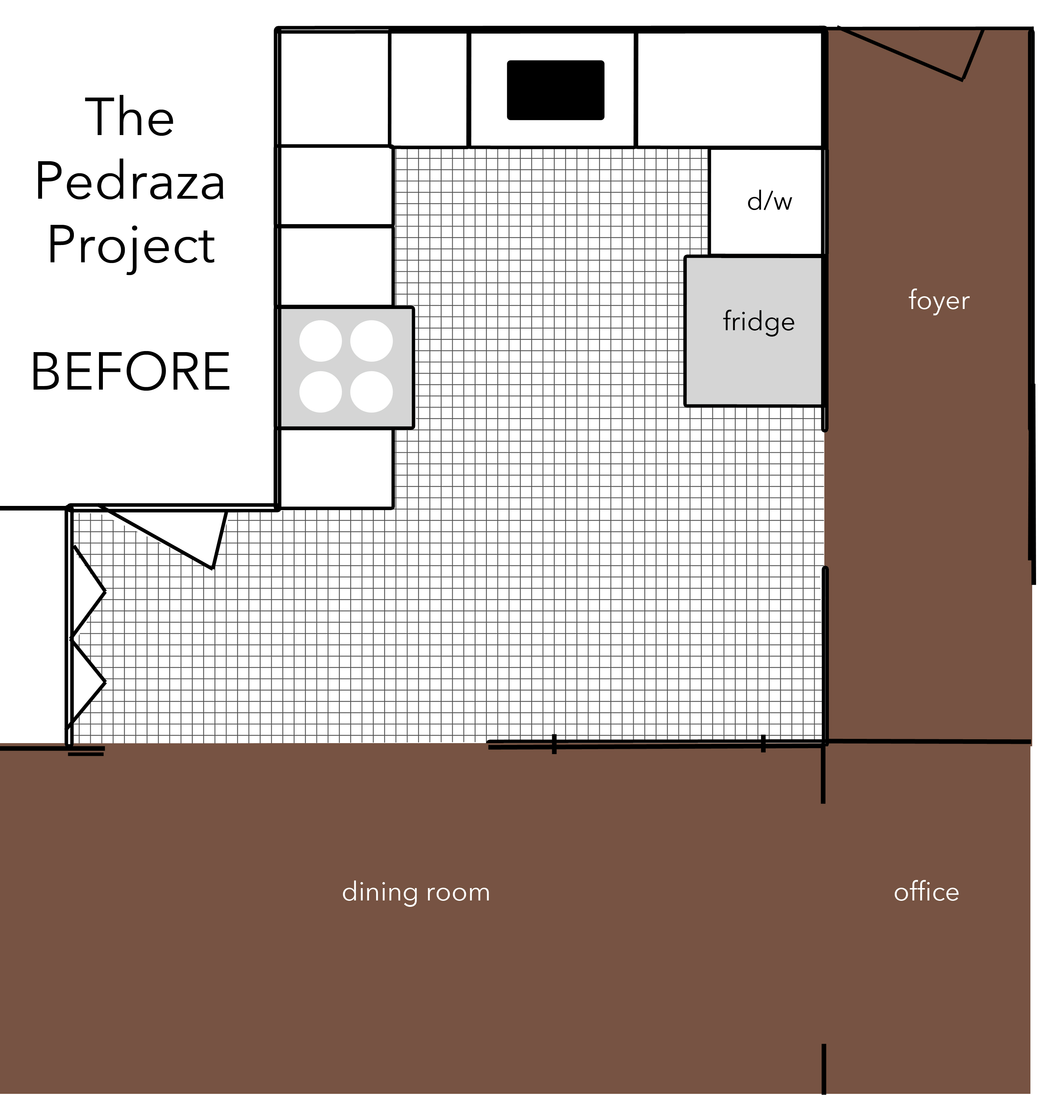
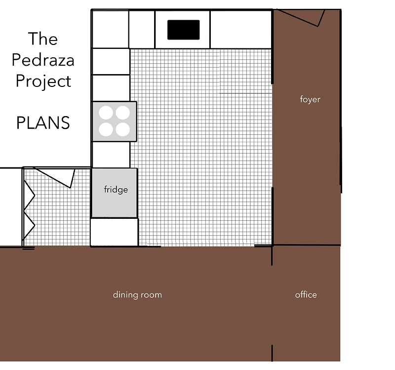
And this is the plan….to put a wall between the laundry and kitchen (DONE! read about that here) and then move the fridge over, build a pantry next to it and then open a new doorway from the kitchen to the dining, and open the foyer wall to have more flow.
I know it sounds like ‘oh and then tear down this wall and open up this one’ – like I am dealing with pieces of paper or legos or something simple but really this required LOTS of planning and determining small details like where to move a out vent, where to move water lines, electrical lines, how to even out flooring, even small things like lighting all needed addressing. After we had a heart to heart with the family about their needs, we wrote down a list of wants vs. needs and figured out that this monster project really needed to function well above all else. Of course I wanted it to look amazing but really – we had to meet the needs first. What’s the point of pretty hardware if the floor constantly shows everything?!
So our list of needs was this:
- fully functioning appliances
- dark hardwearing flooring
- space for more than one person
- accessible food storage
- place for dog to eat food
Those were the must-haves. Simple.
These were the wants:
- butcherblock countertops
- open flow
- full sized fridge
- recessed lighting
- cabinets that closed properly
- warm feeling
- dark lower cabinets
The list of needs seemed a little daunting – the only thing that they knew that they liked were butcher block counters. And with dark flooring, dark lower cabinets and darker counters, I was afraid that the entire space would be very DARK. How can we achieve the light and open and warm feeling if we walk into a dark hole?!
The answer in my mind is dark lower cabinets and white uppers….plus a lot of lighting and picking a backsplash strategically.
We headed to Floor & Decor to get started….
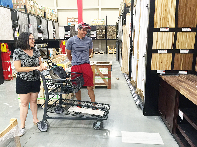
Besides the butcher block, Charity had one opinion….and it was this tile….
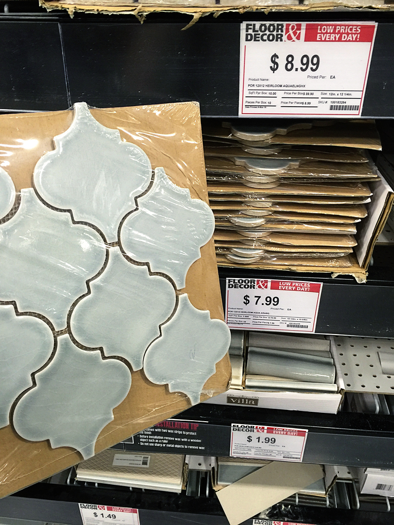
We played around with different tiles at the store till we felt like we got a winning combo and then placed our order.
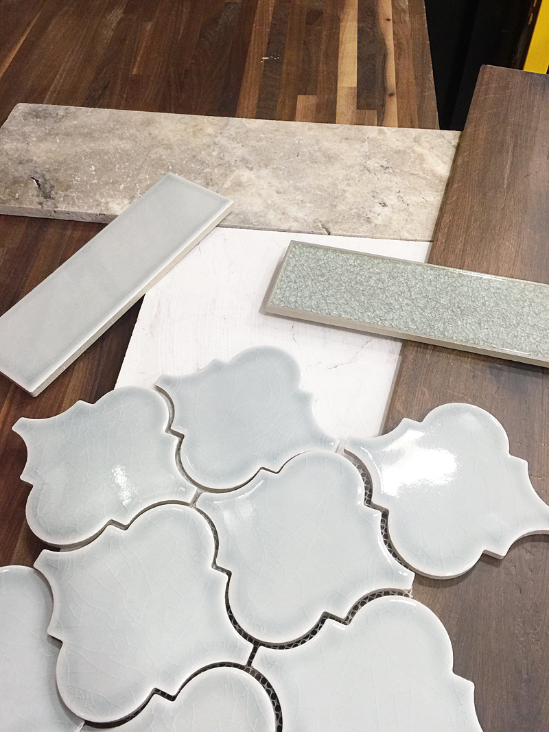
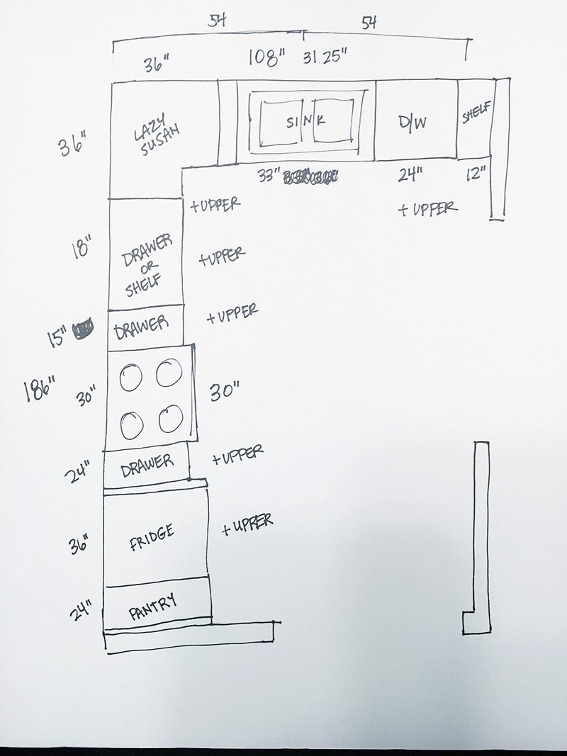
And in the end, this is the plan we came up with…..
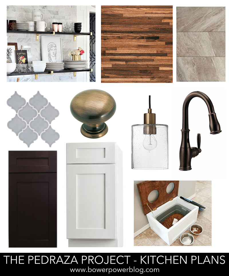
Large format floor tile with lots of variation to hide any dirty footprints or dog hair between cleanings. The cabinets would have the same style door but have dark lowers and light bright white uppers. The butcher block we chose was walnut – which yes, there are TONS of different types of butcher block that they sell at Floor & Decor and each species of wood finishes differently (here is a link to all the different types). That would play nicely with the warmth of the hardware and the light fixture over the sink. And of course, Charity would get her tile that she fell in love with. The dog would get an updated food storage solution (love this one from Katie @ Addicted to DIY) and over it would be some open shelving for decor (this brass version is pretty) and quick access items. Overall – it would play into high contrast with lots of warm tones and different finishes (brass! stainless appliances! bronze faucet!).